Analysis by : CA Rajiv D Khatlawala - Author of "How to profit from Technical Analysis" ( Publ Vision books : www.visionbooksindia.com)
THE ANATOMY OF A CRASH
While there has been a lot of ‘post-mortem’ of the heavy crash in the stock markets in the third week of Jan 2008, there were very few who could anticipate such a fall. But markets were agog with statements like “We always knew it was coming” or “A correction was long overdue” and so on.
Before the crash , most fundamental analysts were trying to give a ‘cause’ to the ‘effect’ of rising indices and justifying higher prices with repetitive arguments like the India growth story, decoupling of Indian markets, minimal effect of US sub-prime concerns et al. However, as a caveat, every one did agree that they were not crystal clear as to why markets were rising and that too so fast.
It is under such a circumstance that the technical analyst’s role assumes prime importance. A major factor being the ‘technician’s’ rational approach to the price movements- he suggests what the price charts depict.
While many technical analyst were surprised by the speed of the fall, seasoned technical analysts had enough indications of an impending fall of about 1000 points in Nifty ( about 3500 points in Sensex).
Many might argue that it is easy to give reasons after the fall. Herein we will try to evaluate whether or not the technical analyst had advance warnings – which anyone knowing the basics of price chart analysis would have easily known (the difficult part is believing what the charts tell).
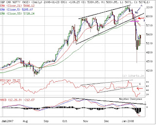
Let us first look at the Daily chart of the widely followed NIFTY Index.
1. The move of the Nifty from mid-October to mid-Jan was almost in a channel – the index made higher highs and higher lows.
2. However the first indication of an exhaustion of trend is when the new highs which are made are not significant. This indicated the analyst that the market has to struggle hard to create a new high.
3. Secondly, when support trend line is drawn on the chart (joining the higher lows), one can see that two days prior to the actual fall, the support trend line was broken (point B marked). This, at the least, told the technical analyst that he must not be long in the index and index heavy weight stocks.
4. Thirdly the support line of the RSI (shown in the lower panel of the price chart) was also broken (point C marked) giving a ‘confirmation’ of the breaking of the trend line on the price chart.
5. This was further again confirmed by the crossover of the 5 day’s moving average and the 21 day’s moving average, two days prior to the fall.
6. Also during this entire movement, the MACD suggested a negative divergence. You are well aware that a negative divergence is a reversal pattern and indicates that the price action and indicator action are not in conformity, creating a doubt on the recent price moves. The negative divergence was also confirmed when prices fell below the support trend line on the price chart (Point B marked)
Chart courtesy : www.icharts.in
Daily Chart of Nifty
CA Rajiv

1 comment:
hi
ooking forward to more such good posts...
Post a Comment